Flutter Playground – Part 2: Login screen

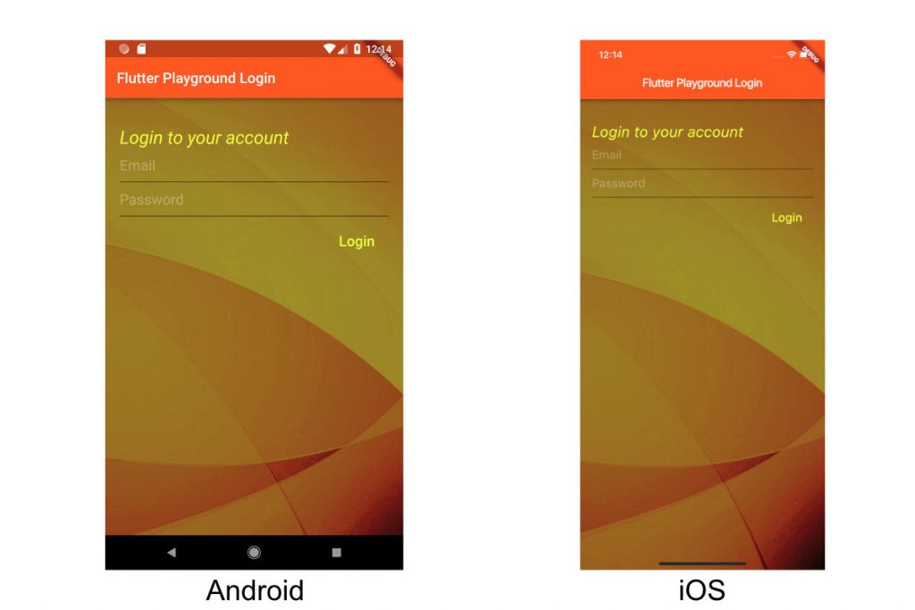
In this post, we will implement this Login screen for both Android and iOS. We will cover a bit on assets, layouts(Stack, Container, Column), and widgets(Text, TextField, MaterialButton).
Layouts and Widgets
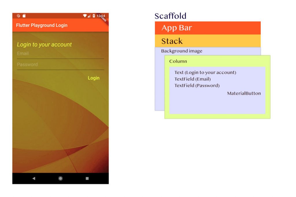
To realize this screen, we will work with the below layouts/containers and widgets. All this will be done by dart

The Scaffold holds the basic material design visual layout structure which can directly host other widgets like an AppBar, BottomAppBar, FloatingActionButton, Drawer, BottomSheet etc.
The AppBar acts as the toolbar for your application.
appBar: AppBar(
  title: Text(widget.title),
),
The body parameter of the Scaffold specifies its primary content. This is displayed below the AppBar, behind the FloatingActionButton and Drawers if present.
@override
Widget build(BuildContext context) {
  return Scaffold(
    appBar: AppBar(
      title: Text(widget.title),
    ),
    body: Stack(
      children: <Widget>[
      ],
    )
  );
}
The Stack is a container where you can place containers or widgets on top of each other. A stack contains an array of widgets.
The first child for the stack is an image, which fills the whole screen and is at the bottom of the stack.
Container(
  decoration: BoxDecoration(
      image: DecorationImage(
          image: AssetImage("images/bg.jpg"), fit: BoxFit.cover)),
),
This draws bg.jpgpubspec.yaml
flutter:
  assets:
    - images/
Let’s define the next child as a Column since we have to display widgets one below the other. The column will need 4 containers for the following:
- Text: “Login to your account”
- TextField: For entering your email
- TextField: For entering your password
- MaterialButton: Login button
We will also be adding some paddings and alignments to the containers, which you can check out in the source code. That would be too much of details for this post.
Container(
  padding: EdgeInsets.only(top: 40, left: 20, right: 20),
  child: Text(
    "Login to your account",
    style: TextStyle(fontSize: 25, color: Colors.limeAccent, fontStyle: FontStyle.italic),
  ),
)
Container(
  padding: EdgeInsets.only(left: 20, right: 20),
  child: TextField(
    style: TextStyle(
      color: Colors.white,
      fontSize: 20,
    ),
    decoration: InputDecoration(
      hintText: "Email",
      hintStyle: TextStyle(
        color: Colors.white30
      ),
    ),
  ),
)
Container(
  padding: EdgeInsets.only(left: 20, right: 20),
  child: TextField(
    style: TextStyle(
      color: Colors.white,
      fontSize: 20,
    ),
    decoration: InputDecoration(
      hintText: "Password",
      hintStyle: TextStyle(
        color: Colors.white30
      )
    ),
  ),
)
Container(
  alignment: AlignmentDirectional.bottomEnd,
  padding: EdgeInsets.only(left: 20, right: 20, top: 10),
  child: MaterialButton(
    child: Text(
        "Login",
      style: TextStyle(
        fontSize: 20,
        color: Colors.limeAccent
      ),
    ),
    onPressed: login,
  ),
)
That’s it. You should be able to see the screens on both Android and iOS.
Source @Github: flutter-playground
Previous post: Flutter Playground – Part 1
Next post: Flutter Playground – Part 3 – Widgets

